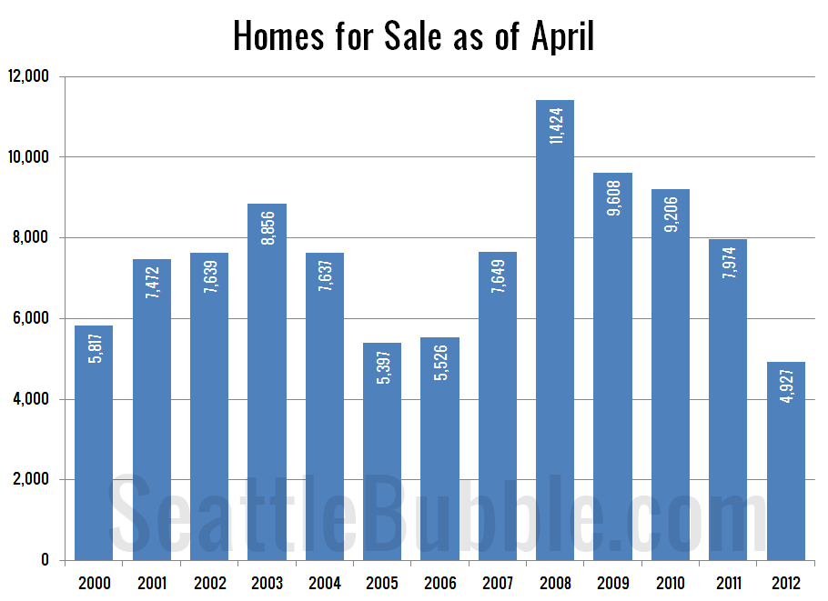
For those following our quixotic search for a new home and for those who just love graphs, below are bar graphs of the housing inventories in April for the past few years and the sales in April for those same years. Given that these include single family and all of King County (read: a bunch of overbuilt suburban plats), these already-bad graph are actually too rosy if you are talking about the condominium market in Seattle. Blurgh.


No comments:
Post a Comment